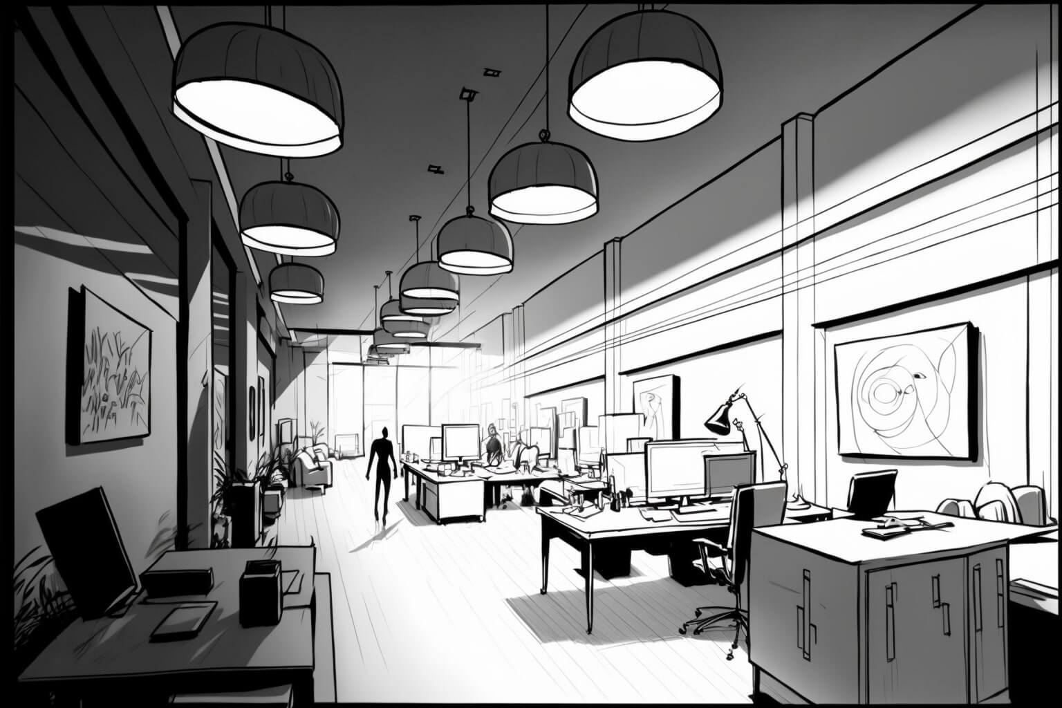
Imagine walking into a coffee shop, instantly feeling a welcoming warmth as your eyes adjust to the soft, amber glow of the lighting. Or picture yourself stepping into a modern office, energized by the crisp, bright white light emanating from sleek overhead fixtures. These are not simply lighting choices; they are deliberate decisions driven by the powerful force of color temperature.

Image: ugreen.io
Color temperature, often expressed in Kelvin (K), dictates the hue – the overall warmth or coolness – of light. While seemingly subtle, this seemingly subtle attribute holds the power to transform a design, influencing emotions, perceptions, and even our physical well-being. In this article, we embark on a journey to uncover what precisely color temperature is, why it matters so much in design, and how its careful implementation can catapult your creative endeavors to new heights.
Understanding the Basics: Delving Deeper into Color Temperature
The concept of color temperature originates from the way heated objects emit light. Think of a piece of metal in a forge as it transitions from a dull red to a brilliant white. The color of the light emitted changes proportionally to the object’s temperature. This concept was extended to quantify the hue of light sources, giving birth to the Kelvin scale, which assigns a unique value to a specific color of light.
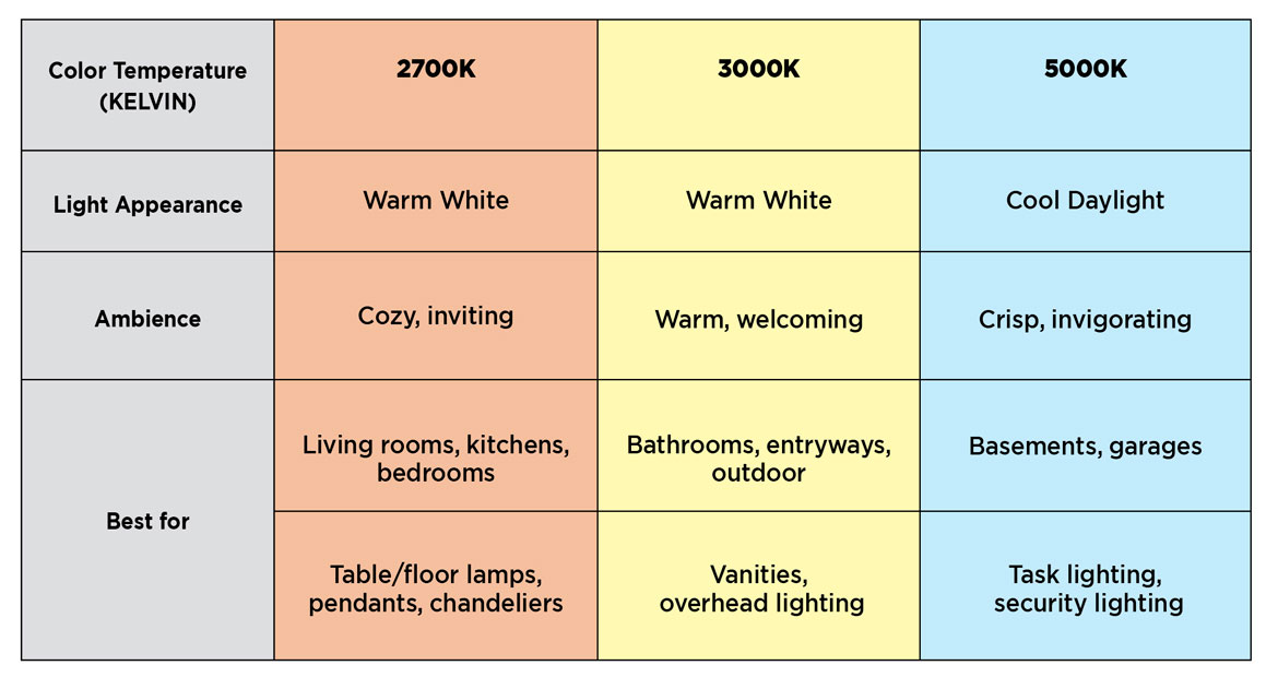
Lower Kelvin values, ranging from 2,700K to 3,000K, represent warm hues like the soft, comforting glow of candlelight. As the Kelvin value escalates, the light becomes cooler, with 5,000K to 6,500K emitting a bluish-white light, akin to daylight.
The Power of Perception: How Color Temperature Shapes Our Emotions and Experience
We are deeply influenced by the ambiance created by different color temperatures, even if subconsciously. Imagine the difference between a candlelit dinner and a meal under the harsh glare of fluorescent lighting. The former evokes feelings of intimacy and relaxation, while the latter might induce feelings of discomfort and anxiety.
Consider these applications:
1) Retail Therapy: Warm-colored lighting, like a warm white (3000K), is known to enhance the appearance of food and fashion, creating a welcoming, appetizing environment that encourages browsing and spending.
2) Healthcare Haven: Cool-colored lighting, often around 4000K to 5000K, is frequently employed in hospitals and clinics to project a sense of cleanliness and professionalism. This color temperature provides a calming and sterile atmosphere, fostering trust in medical settings.
3) Home Sweet Home: The choice of color temperature in your home can drastically alter the mood and ambiance. Warm white, with its cozy and inviting feel, is often preferred in living rooms and bedrooms. In kitchens and workspaces, a cooler, daylight-like white (5000K) is often favored for its energy-boosting and alertness-enhancing effects.
The Role of Color Temperature in Different Design Disciplines
Beyond illumination, the principles of color temperature extend into various aspects of design, influencing the visual aesthetics and overall impact of creative projects:
1) Graphic Design: Color temperature is an integral part of creating visual hierarchy and establishing mood. For example, a webpage featuring a call-to-action might use a warmer color temperature for the button to draw attention and encourage engagement.
2) Interior Design: The warmth or coolness of surfaces, colors, and materials, ultimately influence the overall ambiance of a space. When choosing furniture, textiles, and wall colors, it’s crucial to consider the color temperature of your lighting to create a harmonious and cohesive design.
3) Photography and Videography: Achieving balanced white balance, the technical adjustment of color temperature in imaging, is paramount for capturing accurate and aesthetically pleasing images. A warm color temperature might evoke a romantic and nostalgic mood, while a cool color temperature can contribute to a more modern and impactful aesthetic.

Image: americanwarmoms.org
Mastering the Art of Color Temperature: Practical Tips and Insights
1) Harmony and Contrast: Utilize color temperature to create visual depth and dynamic interplay. A warm accent wall against a cool-toned backdrop in a room can add visual interest and highlight focal points. Or, in a graphic design, employing a warmer color for text against a cooler background can enhance readability.
2) The Power of Context: The ideal color temperature for any project is deeply intertwined with its intended purpose and setting. A design intended for a nightclub would likely embrace a cooler color temperature, while a cozy, intimate setting might benefit from warm, inviting tones.
3) Leverage Expert Help: Seek the counsel of professionals like lighting designers or color consultants when working with color temperature in demanding projects. Their expertise can empower you to achieve the desired atmosphere and elevate your design outcomes.
Why Is Color Temperature Important In Design
Conclusion: Embrace the Nuances of Color Temperature for Design Excellence
Color temperature, while often overlooked, holds the potential to dramatically enrich the design process. By understanding its impact on emotions, perception, and visual aesthetics, we unlock a powerful tool for creating captivating and effective environments that resonate deeply with the audience. Don’t be afraid to experiment, explore, and embrace the nuances of color temperature to elevate your designs and create truly impactful experiences.


