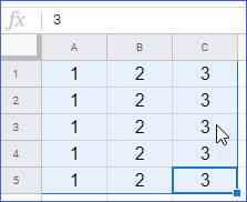
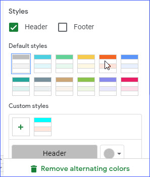
Have you ever looked at a spreadsheet filled with endless rows of data and felt your eyes glaze over? It’s a common problem, and it’s why many people turn to formatting to make their spreadsheets more appealing and easier to digest. One of the simplest yet effective formatting techniques is adding alternating colors to your rows or columns. This seemingly small change can significantly improve readability and make your data pop out. But how do you go about it? Don’t worry, it’s a breeze! Let’s dive into the world of Excel and learn how to add these alternating colors to brighten up your spreadsheets.

Image: excelnotes.com
Adding alternating colors in your Excel spreadsheet is like adding a splash of paint to a canvas. It gives life to your data, making it visually engaging and easier to analyze. Whether you’re a seasoned pro or just starting out with Excel, this guide will walk you through the process step-by-step.
Understanding the Power of Alternating Colors
Before we jump into the steps, let’s first understand why adding alternating colors in Excel is a powerful tool:
- Improved Readability: Imagine reading a book with no spaces between paragraphs. It would be a challenging read, right? Alternating colors create visual breaks in your spreadsheet, making it easier to track different sections of data and reduce eye strain.
- Enhanced Data Organization: By visually differentiating rows or columns, you gain a clearer understanding of data patterns and make it easier to identify specific entries quickly.
- Professional Presentation: Alternating colors create a visually polished presentation, showcasing your data in a more professional and organized manner, making it perfect for sharing with colleagues, clients, or in presentations.
Methods for Adding Alternating Colors
Now, let’s get to the heart of the matter and explore the different ways you can add alternating colors in Excel:
Method 1: Using the “Conditional Formatting” Feature
This method offers an easy and straightforward way to add alternating colors to your sheets. Here’s how to achieve this:
- Select your data: Start by selecting the entire range of data you want to format. If you have a header row, you can exclude it by selecting only the data rows.
- Navigate to the “Conditional Formatting” section: Look for the “Home” tab in the Excel ribbon, and in the “Styles” group, you’ll find the “Conditional Formatting” button. Click on it to open the menu.
- Choose “New Rule…”: From the dropdown menu, choose “New Rule…”.
- Select “Use a formula to determine which cells to format”: In the “New Formatting Rule” dialog box, select the option “Use a formula to determine which cells to format”.
- Enter the formula: Here comes the magic! In the formula box, enter the following formula:
=MOD(ROW(),2)=0This formula checks the row number of the cell (“ROW()”) and uses the “MOD” function to see if it’s evenly divisible by 2. Basically, it will highlight every other row starting with the second row. If you want to highlight every other row starting with the first row, use this formula:
=MOD(ROW(),2)=1 - Choose the Fill Color: Click on the “Format…” button to open the formatting options. Go to the “Fill” tab and select the color you want to use for your alternating rows.
- Apply the rule: Click “OK” to apply the formatting rule, and your spreadsheet will automatically have alternating colors!

Image: excelnotes.com
Method 2: The “Format Painter” Approach
This method is ideal for situations where you want to create a consistent color pattern across several sections of your sheet:
- Format one row manually: Select a single row where you want the color to be applied. Go to the “Home” tab and choose a Fill color from the “Font” group.
- Use the “Format Painter”: On the Home tab, locate the “Format Painter” button, which looks like a paintbrush. Click on it once.
- “Paint” the desired rows: Now, your cursor should have a small paintbrush icon. Select the entire range of rows where you want to apply the same color pattern. The formatting will automatically replicate across all the selected rows.
Advanced Techniques for Alternating Colors
While the methods discussed above cover basic alternating colors, you can take your spreadsheet styling to the next level with these advanced techniques:
- Highlighting every third row: You can customize the MOD function to highlight every third row by changing the formula to:
=MOD(ROW(),3)=0 - Alternating colors with different styles: Take your color scheme to the next level by using different shades of the same color for each row or column. For example, you can use a light shade of green for the first row, a darker shade of green for the second row and then alternate between those two shades. This can make your spreadsheet even more visually appealing and easier to read.
- Adding patterns: Along with colors, you can also add patterns to your cells. This can further improve the visual hierarchy of your data and make it even easier to decipher.
Expert Insights for Maximizing the Impact of Alternating Colors
When using alternating colors, consider these tips from experts:
- Choose contrasting colors: Don’t use colors that are too similar, as this can make it harder for your viewers to distinguish between rows or columns.
- Use color schemes thoughtfully: Stick to a color scheme that complements your spreadsheet’s overall theme and is easy on the eyes.
- Consider accessibility: Remember that some individuals might have color blindness or other visual impairments. Ensure your color choices are easily distinguishable by all.
How To Add Alternating Colors In Excel
Conclusion: Level Up Your Spreadsheet Game
Adding alternating colors in Excel is a simple yet powerful technique that can elevate your spreadsheet from bland to beautiful. It’s a fantastic way to boost readability, organization, and even give a professional touch to your data presentations. So, go out there and unleash your creativity! Play around with formulas and color palettes and discover what works best for your spreadsheets. The world of Excel formatting is your oyster!


